new York Water Taxi
New York Water Taxi (NYWT) was suffering a brand crisis. Their place in the New York tourism market was being overshadowed by competitors and their offerings to locals were almost non-existent in the proper marketing sectors.
ROLE: Marketing Manager, Art Director, Designer, Copywriter
The challenge: Marketing materials lacked cohesion and visual presence.
Exacerbating the matter, New York Water Taxi sold the same products under another brand name. That brand had its own visual identity and was extremely similar in name to a large competitor. Overall the aesthetic of both brands was rather drab, overly complicated, and lifeless.
The solution: Multiple brands were made into one. Design leaned into the icon yellow and checkered taxi aesthetic. A new style guide was created.
Small, unreadable logo was scrapped for dynamic text paired with the classic taxi checkerboard.
A new variable city skyline composition served as a hero image.
The primary map was recreated to improve user experience.
Copy was rewritten to be more customer friendly and persuasive.
A top-tier photographer was hired to bring people and faces to marketing.
Pink was retained from the old design but repurposed as a call to action.
Wave elements and playful fonts gave life to the grid layout.
New pamphlet and map
Before and After
Illustration
As the brand came into focus I realized illustrations had some use cases. I created this custom illustration that made its way onto collateral such as cups and packaging for replica boats.
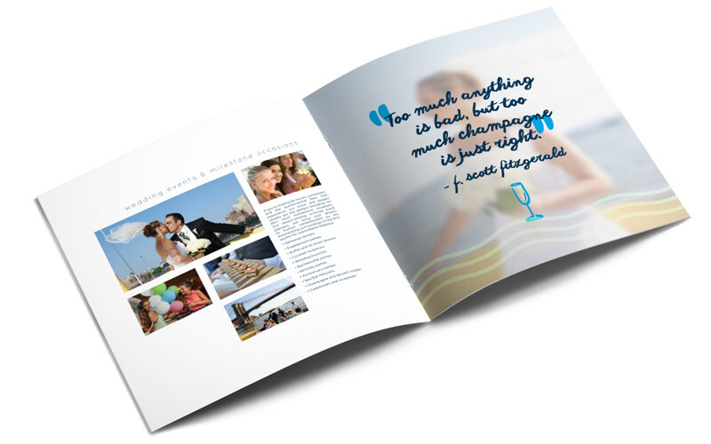
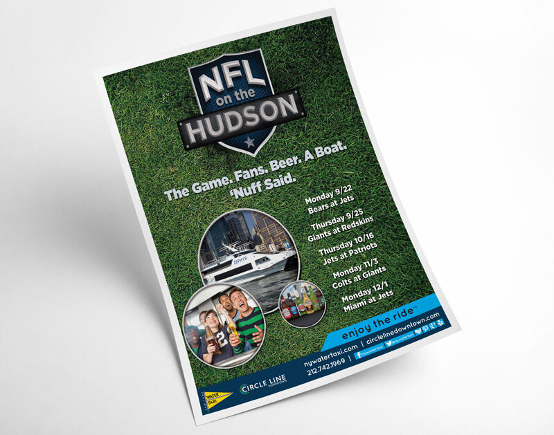
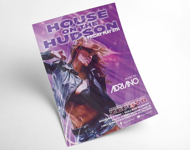
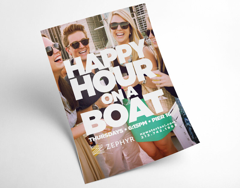
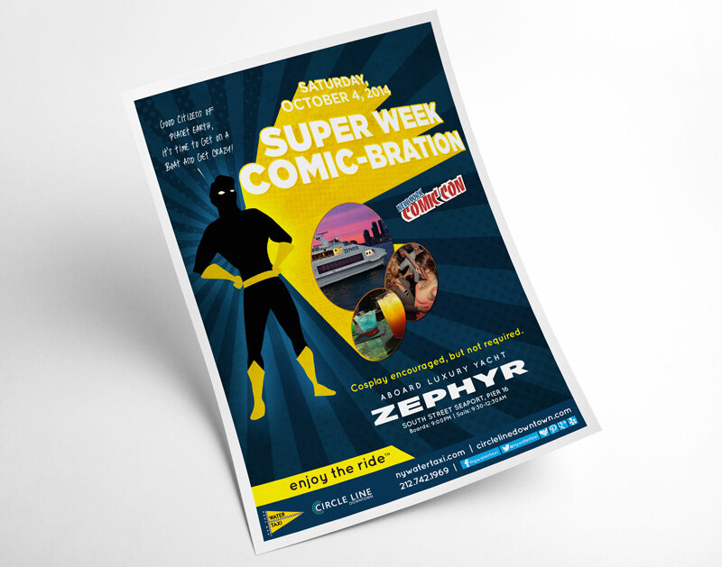
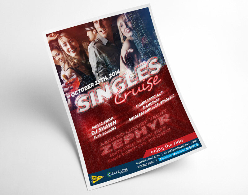
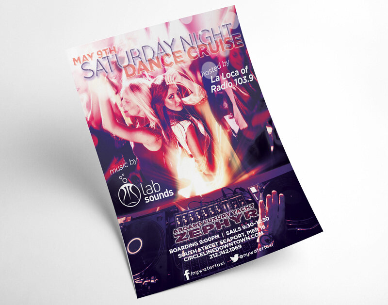
Charters and party boat marketing
The last thing to address was yacht events and charter services that had never received proper marketing. A brochure and a series of custom flyers and email blasts aimed at the local market were created to fill the gap.


